Friday, 16 September 2011

A Bad Start/ Mission Statement


This is a short comic I made recently for my application to the London Print Studio's internship programme. The application involved "explain[ing] in words and pictures why you're interested in comics", so this is kinda like a Mission Statement about my attitude to comics. 

Overall, I think it came out fairly well. I wanted to talk about Frederic Wertham and the Comics Code in a way that would distribute the blame not only to Wertham but to those who stayed silent and allowed the Comics Code to be put into effect. The fact that this was one of the most draconian and strictest censorship acts ever put into effect in Modern Western Society is an affront; than the fact that it inspired very little reaction from the artistic community is inexcusable. 

I wanted to point out that the reaction against that "Seduction of the Innocent" inspired was very much an extension of prejudices that were endemic to High Modernism as a movement in all forms of art at the time. In an era in which defining the "essential nature" of all forms of art (but most notably painting) was the most pertinent issue, synaesthetic art forms such as Comics were slighted for mangling two "noble" arts into a bastard offspring. In addition to these prejudices,  Modernism also encouraged highly elitist divides between "High" art and "Low" art, with Low art often hazily defined as Mass Media. To put it another way, a single, unique abstract painting laboured upon by the artist was the polar opposite of a run of  10,000 Comic Books produced by machine. 

In many ways, Modernism was an extended reaction to and rebellion against Mechanical Reproduction, and to my mind, the Wertham furor was an inevitable vengeful backlash. My one regret with regards to this comic is that for reasons of brevity I've dramatised the libricidic aspects of Wetham's campaign that have captured public imagination for decades. The truly harmful aspects of the American Campaign against Comic Books were the establishment of the Comics Code Authority. The Code was an authority that deftly evaded some serious 1st Amendment infringements by being a de jure "voluntary" certification, but imposed a monopoly on the Comic Book marketplace to such an extent that it became a de facto censorship body.  The Code stifled creativity, bankrupted competitors and allowed Marvel and DC to grab insane amounts of market shares, becoming in effect the only publishers on the market place. And, of course, it inflicted untold damage on the artists themselves. Wether or not Comics were art before the Code is a debatable point; the fact that they weren't after it is beyond any reasonable doubt. Any Comic published under the CCA logo is nothing more than a product

I've touched on some huge issues here in not nearly enough detail to do them justice. You can expect more from me in the future about Wertham, the CCA and the relation between Comics and Modernism.

Note to Art Fans; That's my facsimile of Sir John Everett Millias' Ophelia in panel 3 of page 2; my decision to actually Illustrate Ophelia's death on page 3 raises a great deal of questions about the relationship between Comics, Literature and Art. By illustrating Ophelia's death directly, do I destroy the ambiguity that is the most compelling aspect of her demise, etc? Discuss.


Thursday, 15 September 2011

So Nice To See You Again!

Dana Mellili, Tupperware™ Consultant

So I'm getting back on the horse somewhat with my blog posting by uploading some of my character designs. Currently I'm working on my Comic for the Observer Comic Prize. My one criticism of the Prize is that it doesn't really have a name; or to be more precise, it has an insane surplus of names. It's such a mess of corporate sponsors and jargon that it ends up being called something along the lines of the Observer/Guardian/Comica/Jonathan Cape/Graphic Short Story/Short Fiction/Short Comic/Comic/Prize, 2011, or any combination thereof.

The important points are that it is a) prestigious, b) a chance to see your work printed in a national newspaper and c) pays £1,000 to the winner, and I heartily encourage anyone who hasn't thought about entering yet to do so. It's limited to 4 pages only, a limit that is actually a really interesting challenge yourself against; too long to support something silly and light-hearted, but not really long enough to describe a meaty plot. It seems to hark back to the ancestor of comics and political cartoons in the UK, the illustrated anecdote, in that there's just enough time to sketch a situation and some characters and not a lot else. In any case, it's wonderful practice, so do go for it if you haven't already.

Dana Mellilli, my protagonist, is a Mid-Western Tupperware Consultant and faded one-time beauty queen, and the narrative itself is set around the mid 1960's. The comic that I'm drawing has been a bit of a departure in how I work. I've been laying out all my reference images on a mood board, and I've found that it's a really useful way of having swift reference to any complicated structures you have to draw. It's well worth the time getting one together if you're embarking on a comic, particularly for historical fiction, where accuracy counts to some extent. I've also been greatly inspired by Emily Carroll's wonderful Draw this Dress blog, and am going to start posting some of my own character and costume designs. Have also been re-reading Emily's incredible comic, His Face All Red. It's not only a fantastic long-format comic, but also one that manages incredible pacing, not through techno jiggery-pokery, but pure talent.

That's all for now!

Wednesday, 14 September 2011

Thomas Struth at the Whitechapel Gallery

I've been doing a bit of creative writing to gear up for my dissertation and get back into the swing of writing for pleasure. This is an article on Thomas Struth, an artist whose work is currently on show in the Whitechapel Gallery near Brick Lane. I'd advise anyone who's interested to go along and see it, it's a great exhibition, and well worth the fee. If anyone has advice or suggestions for my writing, I'd love to hear it. I've tried to keep this article as accessible as possible, let me know what you think!
Elliot

Particle Physics and the Parthenon:
Understanding and Uncertainty in the Architectural work of Thomas Struth


A thought occurs whilst circuiting the gallery- is it harder to hang Thomas Struth than it is to get the hang of him? Or, to put it another way, who does one sympathise with; the Gallery Hand who has to wrestle his vast 2x3 meter prints onto the walls, or the critic who has to wrestle the sheer variety of his work into a coherent thesis? Despite initial appearances, Struth is an artist whose apparently diverse and disparate subjects are held together by a very tightly defined ideology; but one that proves coyly elusive.

Tourist spots, family portraits, landscapes; Struth’s work plays with subjects that by rights, a detached and ironic critic would normally treat like the plague, or denounce as hopelessly sentimental. But somehow it works, even though his treatment of the “vulgar” photograph is superficially the only unifying subject linking his oevre. There’s a palpable sense of just how disastrously wrong a lesser photographer could go in these fields, yet in Struth’s hands it all seems to flow effortlessly.
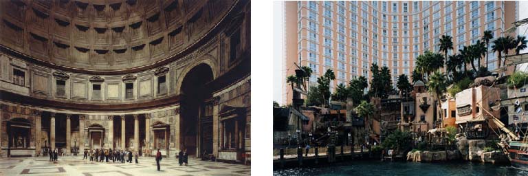
Panthenon, Rom 1990, (183.5 x 238cm) and Las Vegas 1, Las Vegas, Nevada 1999, (179.8 x 240.7cm)
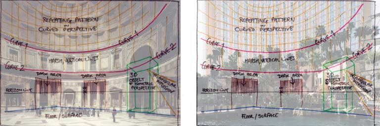
Compositional Similarities


Gape-jawed tourists gawk at Florentine frescos. The epic curvilinear sweep of the Parthenon is referenced in the crass facade of a Vegas Hotel; elsewhere colonnades of Gothic Cathedrals stand in stark contrast to the tiled underside of the Space Shuttle, held aloft by hydraulic pillars. Marvels of Science and Religion don’t so much clash as share a common spectacularisation in photographs that are spectacle in both their physical scale and content. Yet they don’t lean on spectacle as a crutch. There is definitely more than first meets the eye in Struth’s work; but discovering what exactly this is takes some unwrapping.

The exhibition is curated in much the same fashion as you would expect any major international show to be- flawlessly. Connections and parallels between works are quietly suggested, never proscribed; the flow between and around rooms feels smooth and natural; works are hung in groups that resonate clearly and effectively. The curation is an invisible presence that hangs over your shoulder like an unctuous and talented waiter, noticeable only in it’s proficiency.

After an entre and starter of varied architectural shots, your maitre d’ nudges you gently towards what I suppose this rather over-extended metaphor now has to refer to as the fish course, and Semi Submersible Rig, DSME Shipyard, Geoje Island (2007) is a veritable sturgeon in terms of scale.
Semi Submersible Rig, DSME Shipyard, Geoje Island, 2007 (279.5 x 349 cm)

Struth’s largest work to date, Semi Submersible Rig measures a daunting 279.5 x 349cm, and manages to dominate both the Whitechapel Gallery and the shipyards of Geoje Island. An intricate criss-cross of lashings draw us deep into an image that has a remarkably developed depth-of-field in contrast to Struth’s other, intentionally flat prints on display. Here, as with other photos in the lower gallery, eye-boggling complexity and scale chafe alongside a vulnerable, dwarfed human element. The Rig’s presence is menacing- the artist himself compares it to “a bear tied up and brought into a medieval fair”.

From the brutalist structures of the Rig, we are guided carefully up the stairs, through a sudden departure to Struth’s family portraits, before leading on to what is obviously the dramatic denouement of the exhibition, the Jungle Images. Sandwiched between two series of urban prints, the Paradise series makes a clear “Fall from Eden” allusion and is very much the core of the show, with Paradise 9 the acclaimed star. A quick eye over the gallery literature proves that Paradise 9 is most certainly wearing the “Best In Show” rosette- it’s mentioned in almost all the pamphlets and most of the accompanying essays subject it to nigh-excruciating analysis- and seems to be poised in the exhibition as a dramatic 11th-hour entrance into the mind of Mister Thomas Struth, through which the rest of the show can be revisited and re-read. Struth may allegedly “avoid dramatising the pictoral narrative” (Annette Kruzynski, On the Pictoral Structures of Thomas Struth, 2011) but that doesn’t mean his exhibitions are devoid of predictable dramatics.

Paradise 9, Yunnan Province, China, 1999 (268.8 x 339.5 cm)

At first glance, there’s a striking similarity to Jackson Pollock’s Lavender Mist; a remarkable and almost unnerving achievement for a photograph. Pollock’s investigations into abstract expressionism famously lead him to eliminate any representation from his images with random dribbles of paint; the resulting painting becomes nothing more than a flat surface, the confusion of squiggles confounding any attempt to interpret it as three-dimensional space. Struth attempts the impossible, taking a 3D environment and rendering it uninterpretable; the thicket of branches performing the same function as squiggles of paint. Clearly, both are images that are meant to be looked at for the act of “seeing” rather than interpretation. The interest in Paradise 9 lies in the delicate manner in which the forms of foliage both defy and invite understanding:

“The Photographer blocks our path and almost completely closes off the pictoral space as though to literally underline the fact that we are locked out of paradise.”
Annette Kruzynski, On the pictoral structures of Thomas Struth 2011

Annette Kruzynski goes on to describe at length the compositional importance of a single branch in this photograph composed of quite literally nothing but branches. I feel this is somewhat missing the point. The crux of Kruzynski’s argument is that a single, blink-and-you’ll-miss-it slender branch bisects almost the entire length of Paradise 9, dividing its frenetic unstructured chaos into a recognisable composition that can then be partitioned up and interpreted by established rules. In doing so, she unintentionally reduces Struth’s work to a clever flirtation with composition, his images a conflict between order and chaos, his ideas to political, emotional topics; but this is just one reading. The brilliance of Paradise 9 lies in its clarity, and with ideas gleaned from it, you’re free to explore Struth’s work in a new light- but it’s very much the officially sanctioned entrance that a slick curation guides you to unthinkingly. Is hacking a path through the jungle the only method by which we can find a way into his work, or are there other, more civilized entrances?
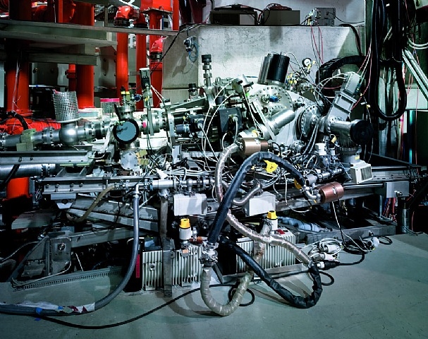
Grazing Incidence Spectrometer, Plank Institute IPP, Garching, 2010, (109.1 x 138 cm)

In amongst the most radically modern and industrial photographs of the exhibition, hangs Grazing Incidence Spectrometer, Planck Institute; a work that feels relatively small with regard to the other pieces in the room. One of the highly technical machines used in subatomic physics by the Planck Institute in Germany, the spectrometer is everything you’d expect it to be: a gleaming construction of stainless steel, mysterious nodes, knotted cables and apparent chaos covering a much more functional, streamlined utilitarianism. One could conclude that therein lies the artist’s motive in creating the piece, and clock off for lunch. But if complexity and the tension between chaos/structure is Struth’s sole purpose in photographing this object, why go to the Planck Institute? Why include the highlighted and prominent label “Grazing Indices” in the shot? Why would you seek this machine, when any other modern computer or server stack displays a similar level of complexity/design? This is clearly a loaded subject, and if we’re uncertain about the artist’s motives for choosing it, then maybe Uncertainty can help us understand.

Max Planck, whose name the institute bears, was in many ways, the founder of Quantum Mechanics, and the spectrometer is a machine that delves into the complex workings of Planck’s quantum world on a daily basis. (The Spectrometer’s purpose is to observe photons and calculate their angle of incidence as they “graze” [or reflect] off other objects.) Planck’s work was the basis for physicists Niels Bohr, Wolfgang Pauli and Werner Hisenburg, who worked together to produce the Copenhagen Interpretation, one of the most commonly taught mathematic interpretations of Quantum Physics. It was Hisenburg who produced one of the most fascinating, paradoxical and misunderstood theories of QM, the Hisenburg Uncertainty Principle.*

The Uncertainty Principle is more than just dry physics, it translates into very real philosophy. And here’s the rub; you find yourself in a position where an electron can’t be said to exist unless it’s observed, but the act of observation inevitably disturbs the electron in some way. There’s no way of getting round this; it’s built into the fabric of reality. Thus, the Uncertainty Principal axiomatically debunks the empirical concept of an independent observer; the experimenter doesn’t exist “outside” the experiment, and his presence in it influences the outcome. To observe is, mathematically, to participate.

This concept becomes key to a more cerebral understanding of Struth’s work, and the reciprocal relationship between art and viewer. Similarly to the reader-relation ideas of Wolfgang Iser, this framework emphasises the art/viewer relationship, and attempts to destroy the concept of the artwork existing as an “independent” object. A work of art, like a painting, or a book, or this essay, doesn’t exist outside of it being read, but that reading will change the work of art. Viewer and artwork are now co-dependent and all emphasis is on the various readings that go on between them. Struth’s depictions of tourist sites and art galleries are an excellent example; the viewers agape at historical artworks, grand architectures and spectacles are each experimenters lost in his or her own interaction with an artwork: yet by being photographed and presented as a subject of artistic interest themselves, Struth makes us keenly aware of our own physicality as a viewer, the relationships that flow between viewer and viewee, and indeed between viewers as collectives.
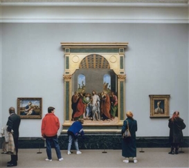


Art Institute of Chicago II, 1990 (137.2 x 172.7 cm) and National Gallery I, 1989 (180.5 x 196.5 cm)

This is particularly evident in the artist’s more playful “gallery” works, photographs that toy with elements of visual wit.The evenness of light and focus in Struth’s work creates a democracy of image, breaking down the distinctions between the two-dimensional characters and the oil paintings they’re looking at: and does so with a wry humour. A woman appears to be rolling her child’s stroller into the vanishing point of a 18th C. Parisian street scene; viewers return the gazes of painted figures, and mirror their postures. In one image of a dark corner in the National Gallery, the Whitechapel’s lighting and the glass of the frame conspire to make a natural mirror, projecting the viewer into the frame and offering them a very literal opportunity to reflect on themselves. The focus shifts from passively viewing the spectacular physical objects in the images to the process of seeing them.

Ideas of “seeing” as a physical action form a leitmotif throughout Struth’s work, questioning and uncovering the divide, so often conflated, between viewing and comprehension. Returning to the aforementioned Grazing Incidence Spectrometer with these ideas, one becomes aware that the machine is very much a mechanical eye- detecting photons in much the same was as camera takes a photograph- a contrivance that sees but is incapable of drawing inferences or conclusions from the data it processes. Just as the subject of the Spectrometer’s study is a mystery to unto itself, so does the Spectrometer represent an insoluble mystery to the human eye. Never the less, we are drawn to trace its curves and revel in its complexity and interrogate it in search of an understanding, an answer, a quanta of certainty, that it can’t possibly provide.

Is there a playful, entertaining aspect to the activity of “seeing”? Is this actually enhanced by objects we see, interpret, but whose levels of complexity we can’t grasp? If so, what does this mean about how we perceive the external world? Does this go some way to understanding the widespread popularity of “vision games” like jigsaw puzzles and optical illusions and magic eye tricks and false perspectives and the drawing that is an old-crone-in-a-fur-coat or a beautiful-woman-in-a-feather-hat but never both at the same time and are we revelling in our own fallibility as visual creatures? And what about the things we think we can see but can’t, the tender webs of relationships that flow between human beings in almost all of Struth’s works, be they architectural or familial, those structures implied but intangible?

I think Thomas Struth’s great talent, his volatile, visionary, fissionary nucleus of genius, is to pose all these questions whilst never loosing sight of what actually engages us with his images; the human element. The fact that we can’t fully resolve his thesis with either cool reason or warm romantics is its greatest appeal. No matter what techniques we use to interrogate his photographs- be they cerebral or empathic- there lies at the heart of his work, of all his works, a dark Planck’s Constant of Uncertainty.

Elliot Baggott, August 2011


* The Hiesenbug Uncertainty Principle is somewhat complicated, but best summarised through a short analogy. Imagine a scientist staring down a microscope at an electron. He’s not able to actually see anything- it’s pitch black because there’s no light at the moment- but he knows it’s there, spinning in the darkness. A particle such as an electron has both momentum (rotation/direction) and position- and a you could attempt to deduce both by shooting a photon (shining a light particle) at the electron. Using a short-wavelength photon (high energy, such as a gamma ray) will give you a clear position of where the electron is; but the gamma ray has a lot of energy, most of which is transferred to the electron in the collision, which radically changes its momentum, making it much less predictable. Use a longer-wave photon, and you disturb the momentum of the electron much less, but can’t find the position anywhere near as accurately. The amount of “Uncertainty” in this trade-off is always the same and referred to as Planck’s Constant.


Wednesday, 13 April 2011

Put Your Hands Up For METROPOLIS - I Love This City.


I recently enjoyed a great cinematic treat; as part of their centenary celebrations, the Brixton Ritzy Picture-house put on a showing of the 1927 classic Metropolis. Much of the footage was edited out after the German Premier of the film, and was considered lost until an almost complete version turned up in 2008. Now, the film is fully restored back to it's (almost) complete running time. For those not in the know, Metropolis is the glamourous zenith of silent film; one of the last to be made before the invention of "talkies", and with a budget of 5 Million Reichsmarks it remains the single most expensive silent film ever made.

Metropolis impresses audiences even today with effects which remain dazzling even eighty years after the premier. I'm rather fond of it myself, as it goes to prove that if you really want your movie to look spectacular even decades after it comes out, then there really is no substitute for actually building the props by hand- see Jaws, Jurassic Park, Logan's Run, etc. But I want to take a step back from the actual spectacle itself, because it's something that a lot of critiques of the film get caught up in: and Metropolis is something much more than just the Avatar of it's day.

The plot of Metropolis is pretty simplistic, and seemingly based in cliche. At the time of the its release, the film was roundly panned. H.G. Wells was one of the most vitriolic critics (for the record, there's little that's more hilarious and pathetic than listening to Sci-fi authors snipe at each other over whose made-up bullshit is the least plausible.) calling it "foolishness, cliché, platitude, and muddlement about mechanical progress and progress in general.". However, some of the best critiques of the film I've read point out that Metropolis isn't supposed to be a realistic vision of the future: rather, it's a Modern Fairy-tale. 


Fairy-tales are interesting. There's something very weird that happens to the willing suspension of disbelief when met with an outrageously simplistic Fairy-tale scenario, and it's one of the best places to study that most elusive of subjects, they "Story-teller's craft". Metropolis is simplistic in that it revolves around a cast of Jungian archetypes: The Richest Man in the World (the King), his Romantic Son (the Prince), the Virtuous Poor Girl, The Most Beautiful Woman in the World, and the deformed Evil Wizard (Mad Scientist). setting Metropolis aside from a traditional Fairy-tale canon is a plot concerned with class-warfare and mechanical society. Metropolis IS a stupid story, but it's a great example of how a stupid story, if told well enough, becomes something quite different. This should come as no surprise to University students, who know the inverse law, that a fascinating subject can be slaughtered by a dull lecturer. 


Metropolis appeals with it's beguilingly simple plot, and takes us on a journey through a world which is both vivid, and somewhat familiar; because, yes, you have seen it before. It's hard to overstate just how influential the architectural scenes of Metropolis have been. Beloved character C3-PO is a pale imitation of the Machine-man of Metropolis, and the buildings themselves have influenced Movies such as Blade Runner and The Fifth Element. Even real buildings have drawn influence from the film; the school of Googie Architecture, and the stream-lined swooshes of classic 50's Americana all draw their inspiration from Lang's Masterpiece. 


Rumors of a remake continually abound on the internet, to the distress and cautious elation of fans. For the time being, there doesn't seem to be any progress on this front, but if there were to be a revival, I think an interesting angle would be to focus on the Machine-man as a character. Created by Rotwang, the mad scientist, the Machine-man is unique in cinematic heritage in that it is a robot, a creature or order and logic, given the order to spread chaos. 


The Machine-man accomplishes this not through unstoppable mechanical brutality, as in Terminator, but by manipulating the humans around her. By taking the form of a beautiful woman, the Machine-man apparently surpasses humanity, not in the usual terms of strength or logic. She is "better" at being a woman than women. She is so alluring, men will kill each other to be with her. Her speeches incite legions of workers to rise up and take to the streets. In the climax, she is undone by the chaos that she has created, laughing maniacally as she is burnt at the stake. Did she succeed? As far as she knows, she has accomplished her mission. Did she "win"?


I can't think of another character quite like her, and I'd be desperate to see more of her transition if a future version were ever made.  


Don't think you've heard the last of this from me, oh no. I have big plans for a new comic which will be unveiled shortly. Until then, 


Elliot


Friday, 25 February 2011

Everything grinds to a .

Oh dear.

 Apologies to anyone who may have been expecting something approaching a regular update schedule from me. Unfortunately it doesn't seem like I'm quite up to that just yet. My plans for the week had been to take you through the print process step by step, with Photos, documentary, witty riposte! Sadly, it was not to be. Certain print technicians who will remain nameless, have abandoned Wimbledon for an all-expenses paid trip to New York, and the Print Studio remains locked without them. Production of TEETH grinds excruciatingly to a halt.

Oh well.
The whole process of silkscreening covers has been nothing but trouble from the start, and now it seems my beloved prints are bowing and warping from the ink. Some time clamped flat in one of the studio's huge binding presses ought to set them straight. I am constantly beset by vexing issues, but for you, my reading public, I soldier through.

So with that all on hold for the indefinite future, I've had to find ways to occupy my time this week. Mostly, I've been researching for an essay I'm hoping to write, which has changed from a single, simple essay, to a grandiose and overarching one, to a small book of interrelated essays I'm thinking of publishing in time for the London Comics and Small Press Expo.

The central topic will be the Future of Print, and my central essay will be a largely speculative work gazing towards publishing trends of the future. You could question the use of such an exercise (or my qualifications for actually writing it) but it's something I want to get off my chest and I feel that it really forms an important influence in terms of the direction my work follows. I feel like it's really important to study the situation in Print today for anyone who has aspirations of being a Printer or a Fine Artist in general (your work will end up in Print at some point).

Issues discussed involve the rise of the e-Reader, escalation of print costs, developments in Small Press and the possible emergence of a counter-culture of Bespoke Printed Novels. An extract;


With sweeping economic change comes a genuine threat to an established literary culture. Since the launch of Penguin books in the 1935, inexpensive mass printing has been the cornerstone of literary society, almost synonymous with Books as a cultural item. The influence that the Penguin model has exerted is hard to overstate; bringing classic fiction within the price range of the common man has increased literacy rates and championed egalitarianism and democracy, and allowed a wide dissemination of ideas. Since Sir Allen Lane’s success in the Thirties, the Mass-Market Paperback (MMP) has become an industry standard, the technique of “Perfect Binding” becoming almost universal. But with increased costs of production, this entire culture could become unsustainable. 
An important question to consider is what the fallout of such a collapse may be, or more poignantly: whether to allow it? Is the trade of cheap paperbacks relevant in the contemporary era? You could easily argue that the beneficial and ethical facets of the MMP as espoused by Penguin stem from it being the cheapest, quickest method to disseminate information at the time. In this sense, the Internet hopelessly outflanks the Paperback. Developing Environmental politics could soon make the book industry seem hopelessly wasteful and decadent to societies of the future. But will an online culture that replaces it, powered electrically, really represent any greater saving?   
Counter cultures will rise! Publishers will fall! Books will burn and e-Readers will freeze! (you may have to reboot them, I hear that usually works). Will unfettered publishing swamp us in an endless sea of Tabloid garbage and celebrity biography, or will fiction retain some kind of value? Will elitism cause a divide between the classes? Will we become as 19th Century Dandies, prizing our "hard format" book collections, or embrace a system where literature has no mass other than the flow of electrons through a processor? To find out, you will have to purchase "Books and the Digital Era!" (working title.)

The other small essays and discussions I have planned for the book include a dark journey into the dynamics of Fan Fiction, and a related study of Meme Theory and the Internet. Next up is "Lost in Scantlation" A look at the bad grammar and syntax that plague Manga scans and translation engines and how this harks back to a 16th century culture of literary piracy. A rousing roundtable discussion "What makes a  Book?" involving some interviews and then a flirting look at what irregular format webcomics have to offer the world of comics in general. Wow!

Is the Medium the Message? Find out soon!

Before I move away from magazines and books entirely, there is one other thing I'd like to share- I recently rescued a  bounty of old magazines from my college library that were slated for the recycling bin. Among them were these fantastic old Wimbledon Art College Magazines which draw most of their visual aesthetic from a certain Flying Circus if you know whaddi mean.


Absolutely classic, although it does make me worry that one day my printed work will have exactly the kind of camp look that I'm mocking here. It's a crime they were thinking of throwing this out, So i'll take you all through it with me later in the week. Until then, 

E x


Wednesday, 16 February 2011

TEETH Update: A Hundred is Actually Quite a Big Number.


Just a little update to showcase some of the glamourous behind-the-scenes work at Serotonin Studios. (NB: not actually a physical studio) The Covers for TEETH are all going to be individually screen printed by yours truly, and this is the first step towards printing the whole damn lot of them. Did I mention this is a numbered Edition of 100? It turns out that a hundred is actually quite a lot when each cover has to be screened by hand. But I'm doing it anyway and it's gonna be a nice touch of class.  


The main benefit of silkscreening is that I get to choose exactly what shade of purple to print the covers in. It's stupidly hard to get a comic to print off the exact shade that it appears on your computer screen, and this is an elegant way around all the various strife inherent in digital printing. Today we are going with this rather fruity shade! The finished comics will probably actually vary from one to another due to ink mixing, which should be really interesting!


A couple of the first prints! Don't they look great? Next comes the layer of black ink on top. Hopefully I should get the bulk of these done by the end of the week.


One final note: the retail price for TEETH is still up for debate, but we're probably looking at something in the region of £4. I don't want to go to far over that. If you are interested in reserving a copy, do drop me a line and we'll work something out. 

That's all for now! Elliot x

Monday, 14 February 2011

Smile Please: TEETH UPDATE


Big news! My first Graphic Short story TEETH is finished and ready to go to print! TEETH is a twelve page b&w comic and this edition also contains the short two-page comic Yesterday, a collaboration between myself and a promising young talent by the name of Charlotte Bronte.

The covers will be silkscreened later this week, and should hopefully turn out a lot better than the cruddy laser-prints I've been playing around with, adding a touch of class to an already exciting publication! More on this and photos of the work in progress to follow.

I'm hoping to print up a large batch of comics this weeks so that there's plenty to sell at the Small Press Expo  taking place on the 12th of March at Goldsmiths College, where you will be able to find myself and a wonderful young Parisien woman by the name of Laura N-Tamara selling comics for fun and profit.

More news on this and other upcoming events soon to come; until then, satisfy your curiosity with some exclusive TEETH previews! E x

Sunday, 6 February 2011

Mathematically Generated Folk Tales


Work in progress for my elective unit about Fairy-tales. This is a bit of an ongoing process but I am essentially writing my own fairy-tales mathematically, using the constraints they give me as a jumping off point to set out the plot. I basically got interested in this type of work from working at the college library. In an art library, the Dewey Decimal system is split down into increasingly lengthy decimals to account for all the similar art-related books there are. You would not believe how many authors thought "Perspectives on Perspective" was a witty title and naturally there has to be some way to distinguish them. This leads to most decimals being about 6 digits long, indicating the subcategories; Art->Artists->Monographs->Painter->European->British->Abstract etc.
I got to thinking that with a designation in the Dewey system gives you a pretty good idea exactly what the book is about, and that you could theoretically write a book to fill a vacant slot as it were. I liked the idea of the system designating content rather than cataloging it.

Fairytales are a pretty good place to start off because they've been elaborately analysed by generations of Western Literature Theorists, as have the conventions of storytelling themselves. Because critics have this penchant for dividing plots into ever broader categories and types, it was fairly easy to organise them into some kind of coherent diagram.

It's a mess of cultural theories lashed together, but it actually seems to function pretty well as a prototype! The user randomly selects one option at each stage (number between 1-3/ number between 1-8, etc) and at the end selects a position in the Aarne-Thompson index, a fantastically arbitrary system that gives Folk tales a position based on genre-type, principal characters, interactions and plot-lines. The Wikipedia article is worth a look, just for how entertainingly obscure the whole list is.
It's been an interesting experiment, and it's made great steps towards what I was aiming for, which was an uncanny, unnerving story; something that riffs off the same rules and formulae of a folk story, but combines the elements in unusual ways, jarringly, disconcertingly muddling archetypes into a story full of symbols but seemingly devoid of meanings. I suppose this is quite a psychoanalytic take on the Fairy-tale as a cultural item, but approaching it from the angle of a rigid structuralist.

Well, whatever.
I'm not completely happy with it yet, and I have a horrible feeling that I will have to add whole new levels of complexity to get the type of results I want, probably involving Tarot cards and and a great deal of shuffling and relocating and those polygonal-dice most commonly favored by Dungeons and Dragons enthusiasts. Which I'm cool with, I guess, I'd just prefer it if it didn't have to be this huge dramatic undertaking with all the paraphernalia. I'd like to keep it simple, like a computer program, but would this ruin the cobbled together aesthetic? More work needed.

Elliot

An Apology

I'll not mince words; my neglect for this website has been terrible. I realise too late that I have fallen into the classic trap of blog posting, and risk becoming "that guy".
"That guy" who spent an idle afternoon causally setting up his blog and tweaking the settings, before embarking on a blatantly unsustainable schedule of posting. "That guy" who made, like, four posts before burning out, returning occasionally to wince at what could have been.
The internet is clogged with "That guys" blogs, useless flotsam of the information age, selfishly hogging all the good domain names.
We have all been "That guy".

So I'm back, with a series of guilt-induced mega-posts to welcome you belatedly into the New Year. Or Chinese New Year, I guess? Anyway, I was never entirely happy with the layout of the blog and the thought of slogging through miles of HTML to tamper erratically with the settings filled me with dread. So expect changes, frequent changes. The banner ought to be changing soon too, and with it, perchance a wallpaper? Who can say. It'll be an adventure, a glorious exciting adventure into dull coding. Do feel free to get back to me with advice and criticism too. Let me know what you think about the layout.

No apologies, though. I'm not going to wriggle out of this one. My lack of updating has mainly been due to my own laziness and it's only through the persistent nagging of my doting boyfriend that I was able to get going again. Thank you Sean, but please never drive me mad like that again. And thank you, loyal readers. Do I have loyal readers? Again, please feel free to let me know. It would make this all just a little more worthwhile.

Elliot

Saturday, 15 May 2010

Men In Skirts

More Magazine Illustrations! This time for an old friend who contacted me about his Arts and Culture Mag. These Illustrations are for an article entitled "Real Men Wear Skirts". My original plan was to draw the kilted Scotsman, then move onto some more modern Illustrations, but I had much more fun drawing guys in skirts through the ages! A surprising amount of armies have at some point had skirted uniforms. So at least that fulfills my brief of "Nothing too effeminate." What could be more manly and suggestive than a Flintlock Rifle, I ask you? Nothing, that's what.