Particle Physics and the Parthenon:
Understanding and Uncertainty in the Architectural work of Thomas Struth
A thought occurs whilst circuiting the gallery- is it harder to hang Thomas Struth than it is to get the hang of him? Or, to put it another way, who does one sympathise with; the Gallery Hand who has to wrestle his vast 2x3 meter prints onto the walls, or the critic who has to wrestle the sheer variety of his work into a coherent thesis? Despite initial appearances, Struth is an artist whose apparently diverse and disparate subjects are held together by a very tightly defined ideology; but one that proves coyly elusive.
Tourist spots, family portraits, landscapes; Struth’s work plays with subjects that by rights, a detached and ironic critic would normally treat like the plague, or denounce as hopelessly sentimental. But somehow it works, even though his treatment of the “vulgar” photograph is superficially the only unifying subject linking his oevre. There’s a palpable sense of just how disastrously wrong a lesser photographer could go in these fields, yet in Struth’s hands it all seems to flow effortlessly.
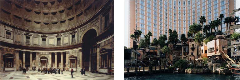
Panthenon, Rom 1990, (183.5 x 238cm) and Las Vegas 1, Las Vegas, Nevada 1999, (179.8 x 240.7cm)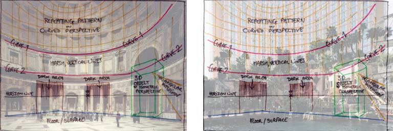
Compositional Similarities
Gape-jawed tourists gawk at Florentine frescos. The epic curvilinear sweep of the Parthenon is referenced in the crass facade of a Vegas Hotel; elsewhere colonnades of Gothic Cathedrals stand in stark contrast to the tiled underside of the Space Shuttle, held aloft by hydraulic pillars. Marvels of Science and Religion don’t so much clash as share a common spectacularisation in photographs that are spectacle in both their physical scale and content. Yet they don’t lean on spectacle as a crutch. There is definitely more than first meets the eye in Struth’s work; but discovering what exactly this is takes some unwrapping.
The exhibition is curated in much the same fashion as you would expect any major international show to be- flawlessly. Connections and parallels between works are quietly suggested, never proscribed; the flow between and around rooms feels smooth and natural; works are hung in groups that resonate clearly and effectively. The curation is an invisible presence that hangs over your shoulder like an unctuous and talented waiter, noticeable only in it’s proficiency.
After an entre and starter of varied architectural shots, your maitre d’ nudges you gently towards what I suppose this rather over-extended metaphor now has to refer to as the fish course, and Semi Submersible Rig, DSME Shipyard, Geoje Island (2007) is a veritable sturgeon in terms of scale. 
Semi Submersible Rig, DSME Shipyard, Geoje Island, 2007 (279.5 x 349 cm)
Struth’s largest work to date, Semi Submersible Rig measures a daunting 279.5 x 349cm, and manages to dominate both the Whitechapel Gallery and the shipyards of Geoje Island. An intricate criss-cross of lashings draw us deep into an image that has a remarkably developed depth-of-field in contrast to Struth’s other, intentionally flat prints on display. Here, as with other photos in the lower gallery, eye-boggling complexity and scale chafe alongside a vulnerable, dwarfed human element. The Rig’s presence is menacing- the artist himself compares it to “a bear tied up and brought into a medieval fair”.
From the brutalist structures of the Rig, we are guided carefully up the stairs, through a sudden departure to Struth’s family portraits, before leading on to what is obviously the dramatic denouement of the exhibition, the Jungle Images. Sandwiched between two series of urban prints, the Paradise series makes a clear “Fall from Eden” allusion and is very much the core of the show, with Paradise 9 the acclaimed star. A quick eye over the gallery literature proves that Paradise 9 is most certainly wearing the “Best In Show” rosette- it’s mentioned in almost all the pamphlets and most of the accompanying essays subject it to nigh-excruciating analysis- and seems to be poised in the exhibition as a dramatic 11th-hour entrance into the mind of Mister Thomas Struth, through which the rest of the show can be revisited and re-read. Struth may allegedly “avoid dramatising the pictoral narrative” (Annette Kruzynski, On the Pictoral Structures of Thomas Struth, 2011) but that doesn’t mean his exhibitions are devoid of predictable dramatics.
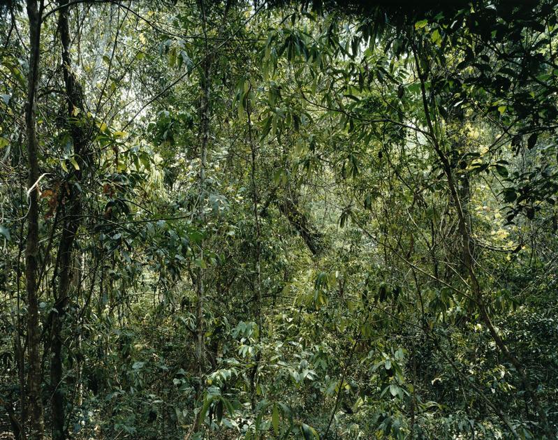
Paradise 9, Yunnan Province, China, 1999 (268.8 x 339.5 cm)
At first glance, there’s a striking similarity to Jackson Pollock’s Lavender Mist; a remarkable and almost unnerving achievement for a photograph. Pollock’s investigations into abstract expressionism famously lead him to eliminate any representation from his images with random dribbles of paint; the resulting painting becomes nothing more than a flat surface, the confusion of squiggles confounding any attempt to interpret it as three-dimensional space. Struth attempts the impossible, taking a 3D environment and rendering it uninterpretable; the thicket of branches performing the same function as squiggles of paint. Clearly, both are images that are meant to be looked at for the act of “seeing” rather than interpretation. The interest in Paradise 9 lies in the delicate manner in which the forms of foliage both defy and invite understanding:
“The Photographer blocks our path and almost completely closes off the pictoral space as though to literally underline the fact that we are locked out of paradise.”
Annette Kruzynski, On the pictoral structures of Thomas Struth 2011
Annette Kruzynski goes on to describe at length the compositional importance of a single branch in this photograph composed of quite literally nothing but branches. I feel this is somewhat missing the point. The crux of Kruzynski’s argument is that a single, blink-and-you’ll-miss-it slender branch bisects almost the entire length of Paradise 9, dividing its frenetic unstructured chaos into a recognisable composition that can then be partitioned up and interpreted by established rules. In doing so, she unintentionally reduces Struth’s work to a clever flirtation with composition, his images a conflict between order and chaos, his ideas to political, emotional topics; but this is just one reading. The brilliance of Paradise 9 lies in its clarity, and with ideas gleaned from it, you’re free to explore Struth’s work in a new light- but it’s very much the officially sanctioned entrance that a slick curation guides you to unthinkingly. Is hacking a path through the jungle the only method by which we can find a way into his work, or are there other, more civilized entrances?
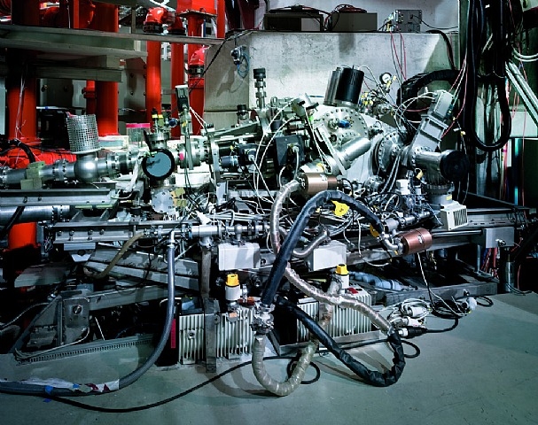
Grazing Incidence Spectrometer, Plank Institute IPP, Garching, 2010, (109.1 x 138 cm)
In amongst the most radically modern and industrial photographs of the exhibition, hangs Grazing Incidence Spectrometer, Planck Institute; a work that feels relatively small with regard to the other pieces in the room. One of the highly technical machines used in subatomic physics by the Planck Institute in Germany, the spectrometer is everything you’d expect it to be: a gleaming construction of stainless steel, mysterious nodes, knotted cables and apparent chaos covering a much more functional, streamlined utilitarianism. One could conclude that therein lies the artist’s motive in creating the piece, and clock off for lunch. But if complexity and the tension between chaos/structure is Struth’s sole purpose in photographing this object, why go to the Planck Institute? Why include the highlighted and prominent label “Grazing Indices” in the shot? Why would you seek this machine, when any other modern computer or server stack displays a similar level of complexity/design? This is clearly a loaded subject, and if we’re uncertain about the artist’s motives for choosing it, then maybe Uncertainty can help us understand.
Max Planck, whose name the institute bears, was in many ways, the founder of Quantum Mechanics, and the spectrometer is a machine that delves into the complex workings of Planck’s quantum world on a daily basis. (The Spectrometer’s purpose is to observe photons and calculate their angle of incidence as they “graze” [or reflect] off other objects.) Planck’s work was the basis for physicists Niels Bohr, Wolfgang Pauli and Werner Hisenburg, who worked together to produce the Copenhagen Interpretation, one of the most commonly taught mathematic interpretations of Quantum Physics. It was Hisenburg who produced one of the most fascinating, paradoxical and misunderstood theories of QM, the Hisenburg Uncertainty Principle.*
The Uncertainty Principle is more than just dry physics, it translates into very real philosophy. And here’s the rub; you find yourself in a position where an electron can’t be said to exist unless it’s observed, but the act of observation inevitably disturbs the electron in some way. There’s no way of getting round this; it’s built into the fabric of reality. Thus, the Uncertainty Principal axiomatically debunks the empirical concept of an independent observer; the experimenter doesn’t exist “outside” the experiment, and his presence in it influences the outcome. To observe is, mathematically, to participate.
This concept becomes key to a more cerebral understanding of Struth’s work, and the reciprocal relationship between art and viewer. Similarly to the reader-relation ideas of Wolfgang Iser, this framework emphasises the art/viewer relationship, and attempts to destroy the concept of the artwork existing as an “independent” object. A work of art, like a painting, or a book, or this essay, doesn’t exist outside of it being read, but that reading will change the work of art. Viewer and artwork are now co-dependent and all emphasis is on the various readings that go on between them. Struth’s depictions of tourist sites and art galleries are an excellent example; the viewers agape at historical artworks, grand architectures and spectacles are each experimenters lost in his or her own interaction with an artwork: yet by being photographed and presented as a subject of artistic interest themselves, Struth makes us keenly aware of our own physicality as a viewer, the relationships that flow between viewer and viewee, and indeed between viewers as collectives.
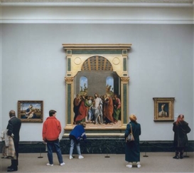
Art Institute of Chicago II, 1990 (137.2 x 172.7 cm) and National Gallery I, 1989 (180.5 x 196.5 cm)
This is particularly evident in the artist’s more playful “gallery” works, photographs that toy with elements of visual wit.The evenness of light and focus in Struth’s work creates a democracy of image, breaking down the distinctions between the two-dimensional characters and the oil paintings they’re looking at: and does so with a wry humour. A woman appears to be rolling her child’s stroller into the vanishing point of a 18th C. Parisian street scene; viewers return the gazes of painted figures, and mirror their postures. In one image of a dark corner in the National Gallery, the Whitechapel’s lighting and the glass of the frame conspire to make a natural mirror, projecting the viewer into the frame and offering them a very literal opportunity to reflect on themselves. The focus shifts from passively viewing the spectacular physical objects in the images to the process of seeing them.
Ideas of “seeing” as a physical action form a leitmotif throughout Struth’s work, questioning and uncovering the divide, so often conflated, between viewing and comprehension. Returning to the aforementioned Grazing Incidence Spectrometer with these ideas, one becomes aware that the machine is very much a mechanical eye- detecting photons in much the same was as camera takes a photograph- a contrivance that sees but is incapable of drawing inferences or conclusions from the data it processes. Just as the subject of the Spectrometer’s study is a mystery to unto itself, so does the Spectrometer represent an insoluble mystery to the human eye. Never the less, we are drawn to trace its curves and revel in its complexity and interrogate it in search of an understanding, an answer, a quanta of certainty, that it can’t possibly provide.
Is there a playful, entertaining aspect to the activity of “seeing”? Is this actually enhanced by objects we see, interpret, but whose levels of complexity we can’t grasp? If so, what does this mean about how we perceive the external world? Does this go some way to understanding the widespread popularity of “vision games” like jigsaw puzzles and optical illusions and magic eye tricks and false perspectives and the drawing that is an old-crone-in-a-fur-coat or a beautiful-woman-in-a-feather-hat but never both at the same time and are we revelling in our own fallibility as visual creatures? And what about the things we think we can see but can’t, the tender webs of relationships that flow between human beings in almost all of Struth’s works, be they architectural or familial, those structures implied but intangible?
I think Thomas Struth’s great talent, his volatile, visionary, fissionary nucleus of genius, is to pose all these questions whilst never loosing sight of what actually engages us with his images; the human element. The fact that we can’t fully resolve his thesis with either cool reason or warm romantics is its greatest appeal. No matter what techniques we use to interrogate his photographs- be they cerebral or empathic- there lies at the heart of his work, of all his works, a dark Planck’s Constant of Uncertainty.
Elliot Baggott, August 2011
*
The Hiesenbug Uncertainty Principle is somewhat complicated, but best summarised through a short analogy. Imagine a scientist staring down a microscope at an electron. He’s not able to actually see anything- it’s pitch black because there’s no light at the moment- but he knows it’s there, spinning in the darkness. A particle such as an electron has both momentum (rotation/direction) and position- and a you could attempt to deduce both by shooting a photon (shining a light particle) at the electron. Using a short-wavelength photon (high energy, such as a gamma ray) will give you a clear position of where the electron is; but the gamma ray has a lot of energy, most of which is transferred to the electron in the collision, which radically changes its momentum, making it much less predictable. Use a longer-wave photon, and you disturb the momentum of the electron much less, but can’t find the position anywhere near as accurately. The amount of “Uncertainty” in this trade-off is always the same and referred to as Planck’s Constant.


